
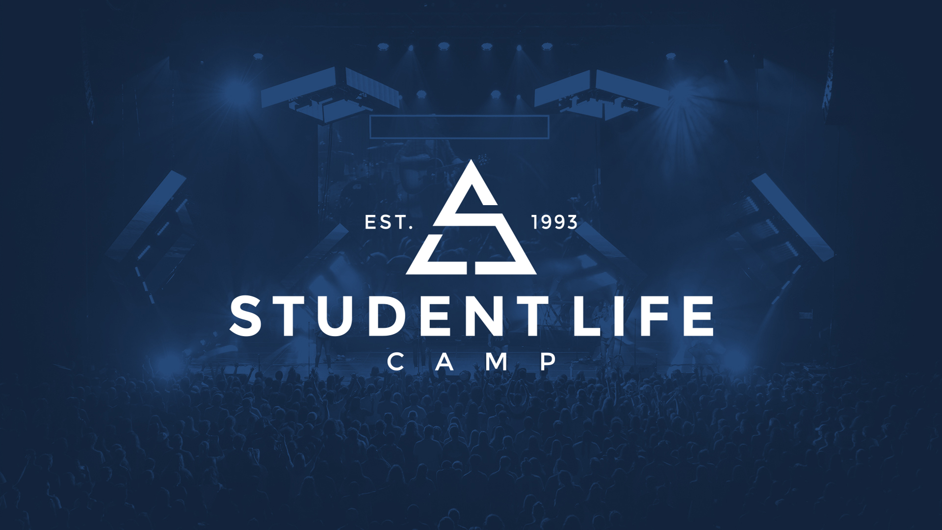
STUDENT LIFE CAMP REBRAND
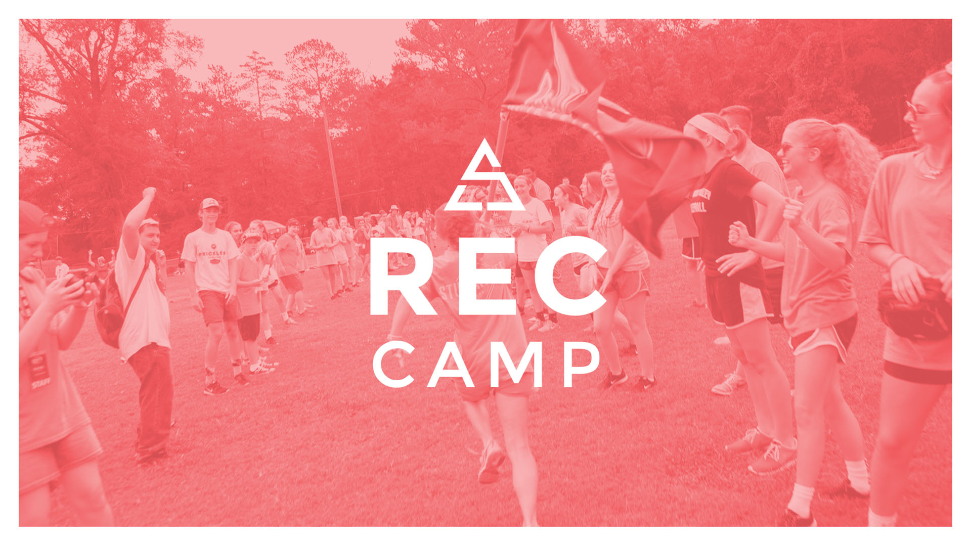
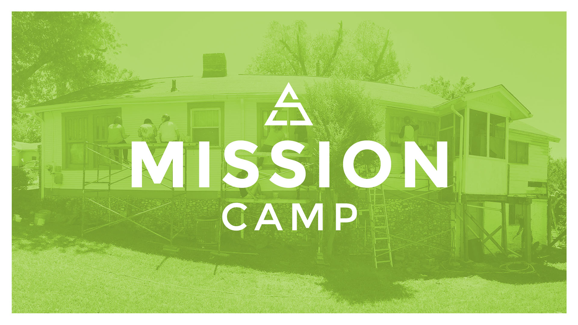
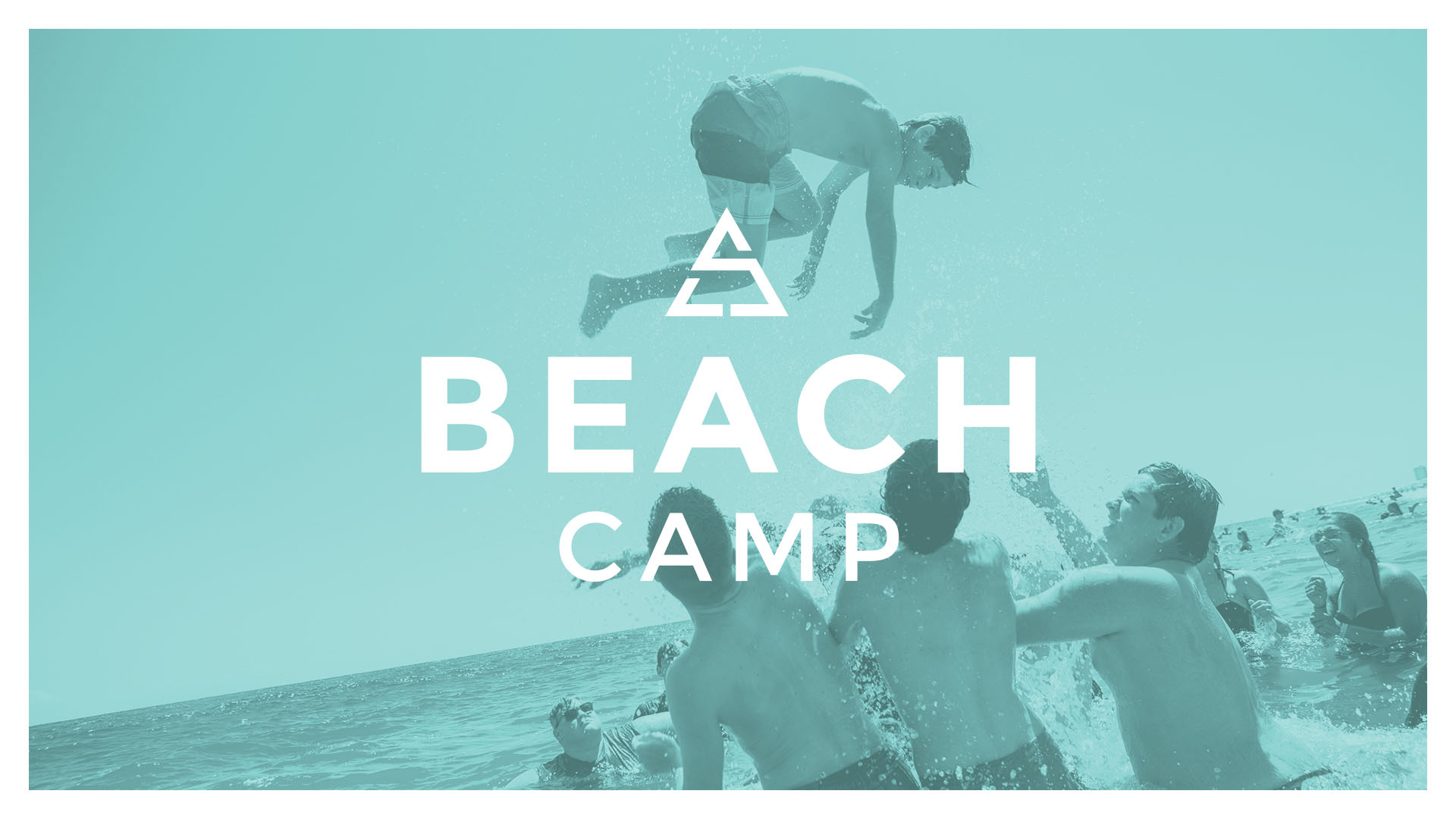
The reason for this rebrand was to modernize. The logo combines "S" and "L" into a versatile icon that can be used in the secondary branding to create consistencty between product branding. The previous logo and branding had been in place for over a decade. The colors were chosen to represent each product type while remaining complimentary. The primary navy was chosen to be bold and represent a reliable professionalism. The secondary colors were chosen to be vibrant and exciting to engage a youthful clientele.
Branding for the product types uses the main icon to maintain recognizability. The secondary colors were chosen to be vibrant and exciting to engage a youthful clientelle.
Logo Design
No items found.