STUDENTLIFE.COM 2017 REDESIGN
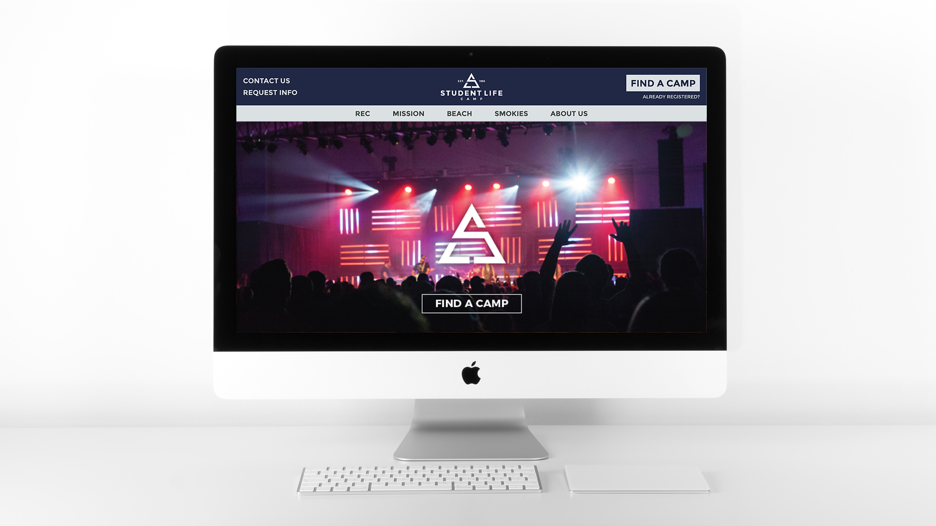
This design update streamlined many aspects of the user experience by focusing on important content and shifting to long-scroll pages that walk you through the experience. The homepage was designed as an introduction to Student Life and walked the viewer through all the details of camp in the order that is generally most important to Student Life customers during the process of choosing a camp. The hero video showed a variety of camp activites and gives a quick and exciting look at some of the things that set Student Life apart in the industry.
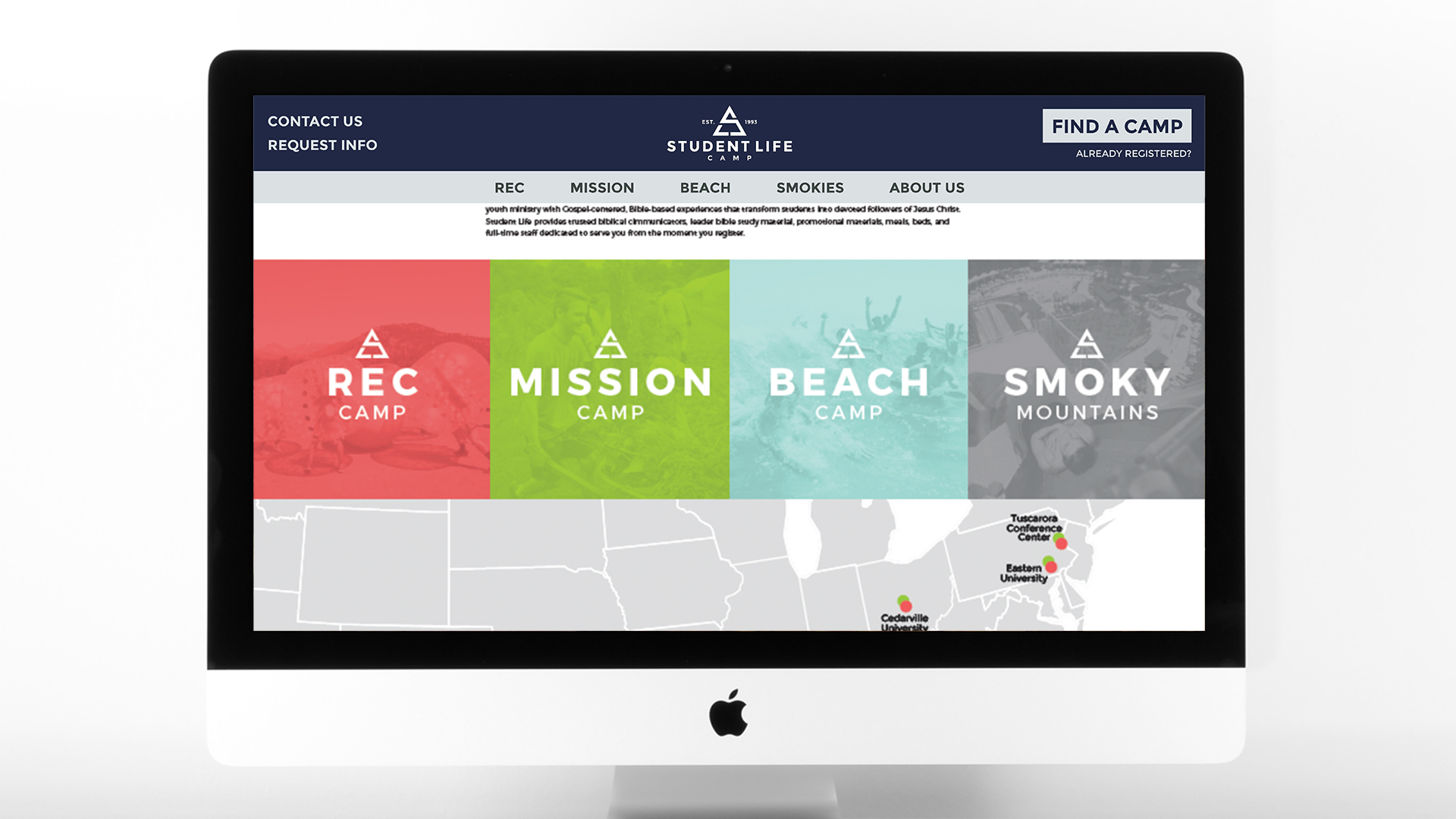
Scrolling through the homepage, a potential customer would initially see a brief description of why Student Life exists and what their goals are in serving their customers. After that, the available product offerings are shown as a key for the map of locations. Below the map is a description of the latest theme, an explanation of the products and what makes them different, followed by an option to get more information. It was important that the site include photos of the staff becuase one of the brand differentiators was a personal guide to assist the customer from registration to the day of the event.
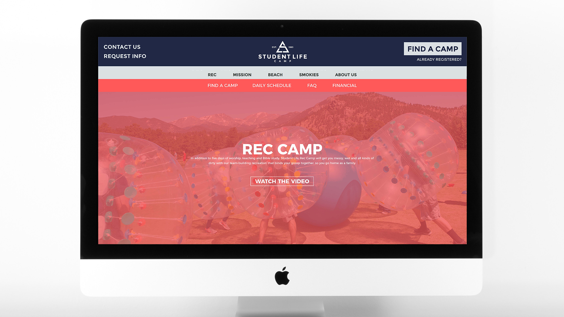
Student Life Camp offers four product types and each was given a descriptive page to walk the viewer through the experience of that camp. The hero video is a subtle loop to provide a bit of motion and dynamic to the pages. The color overlays represent the individual product type and carry over throughout the site. A brief description, schedule, large photos, FAQs and financial info are presented in order of importance based on the registration process.
While there are many ways this search page could function, this was the simplest and easiest to navigate. With 4 product types and over 80 events, the challenge was figuring out what is most important in the choosing process and how to funnel the viewer toward a registration.
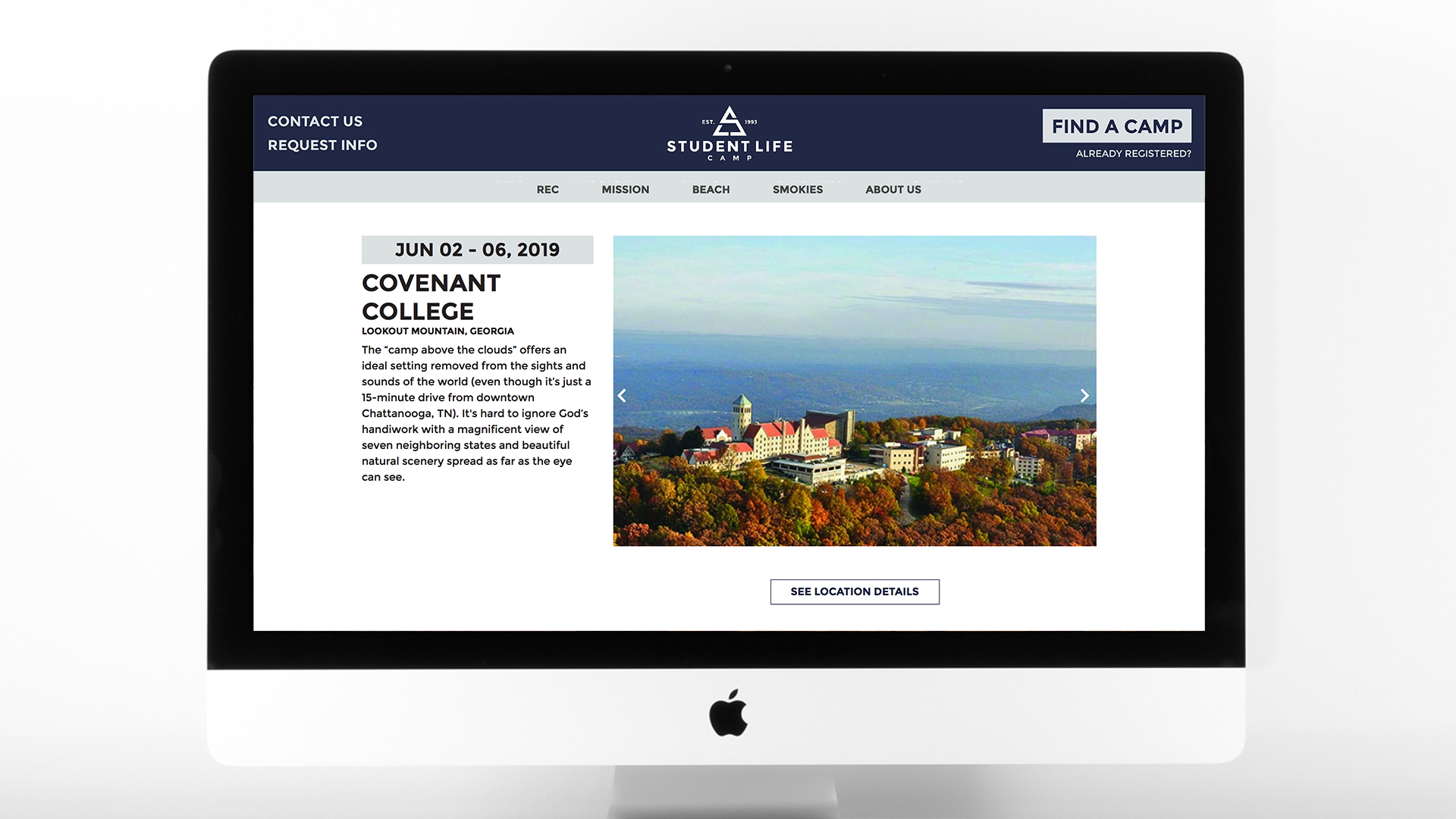
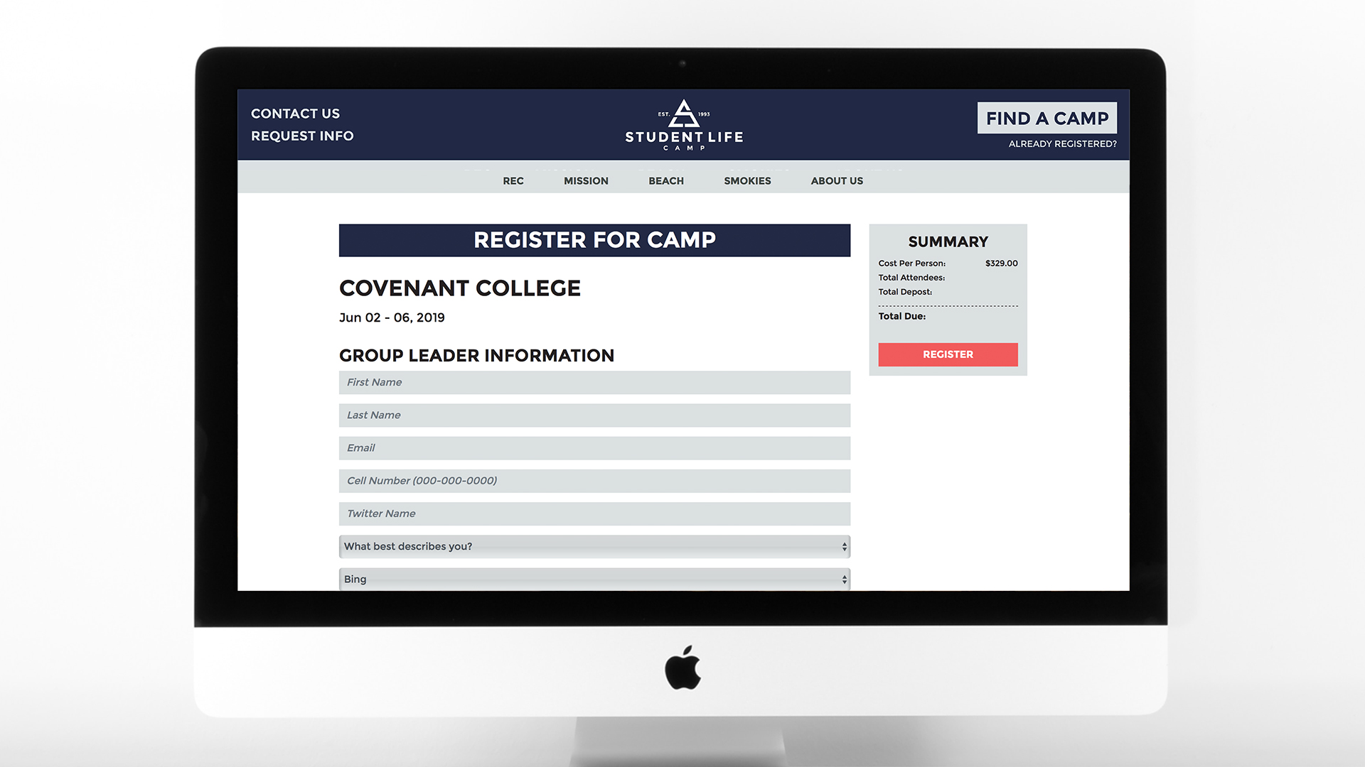
Individual event pages provide details about the location and the attending personalities including dates, location description, leader bios, and photo gallery. The registration page was streamlined to focus on getting the most important information and remove extraneous questions. A summary was also added to make the process clearer for the user.