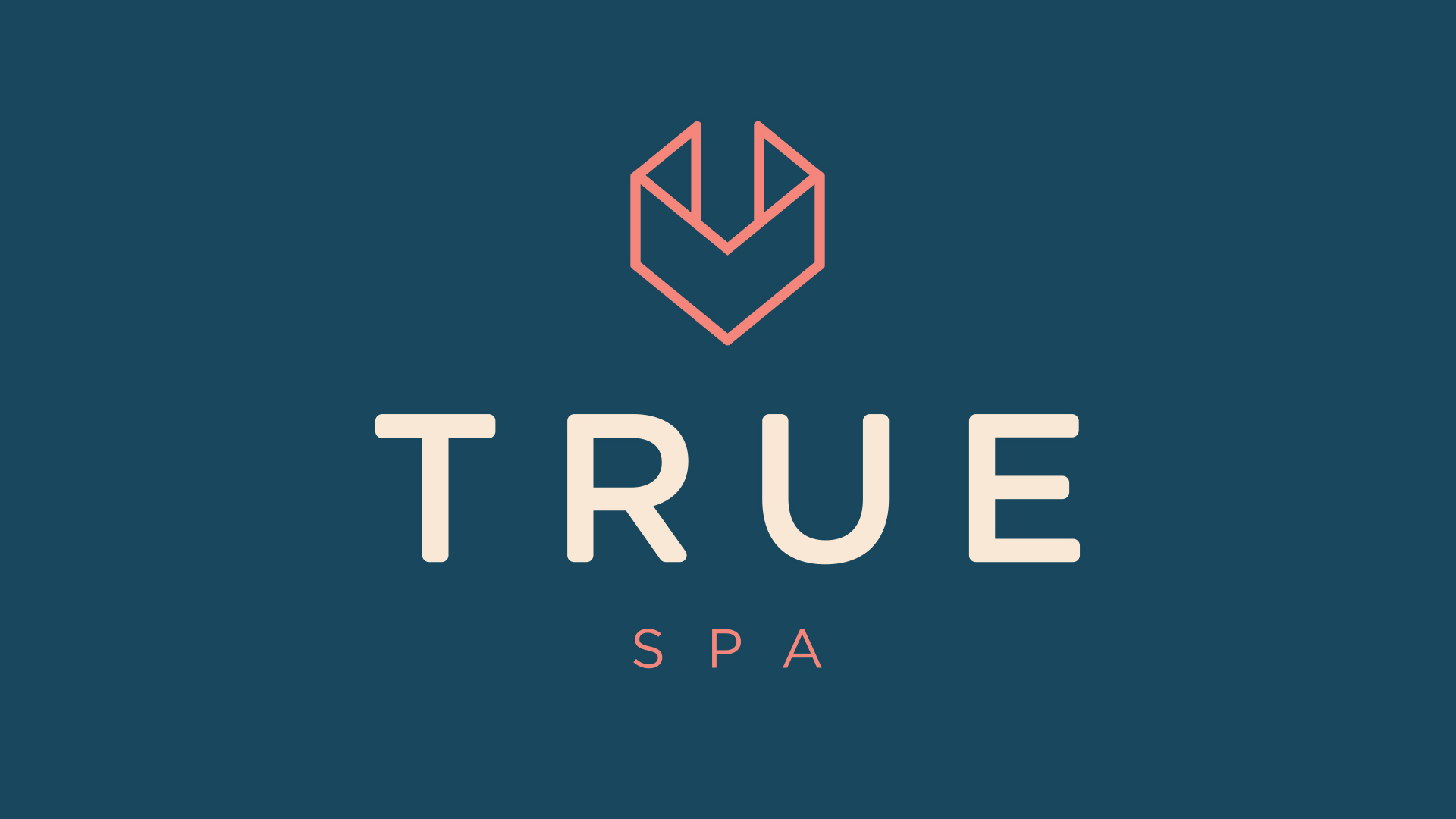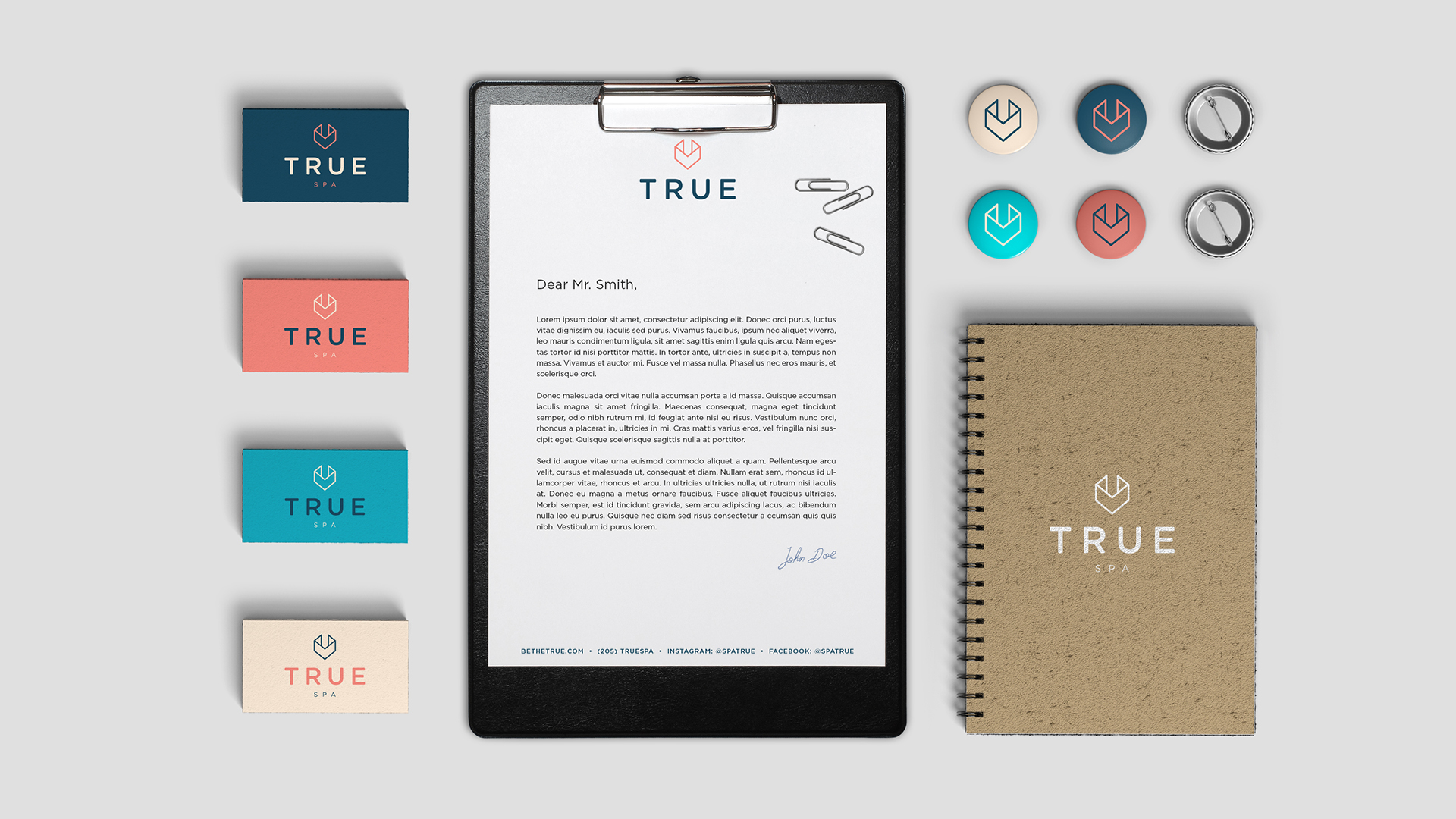
TRUE
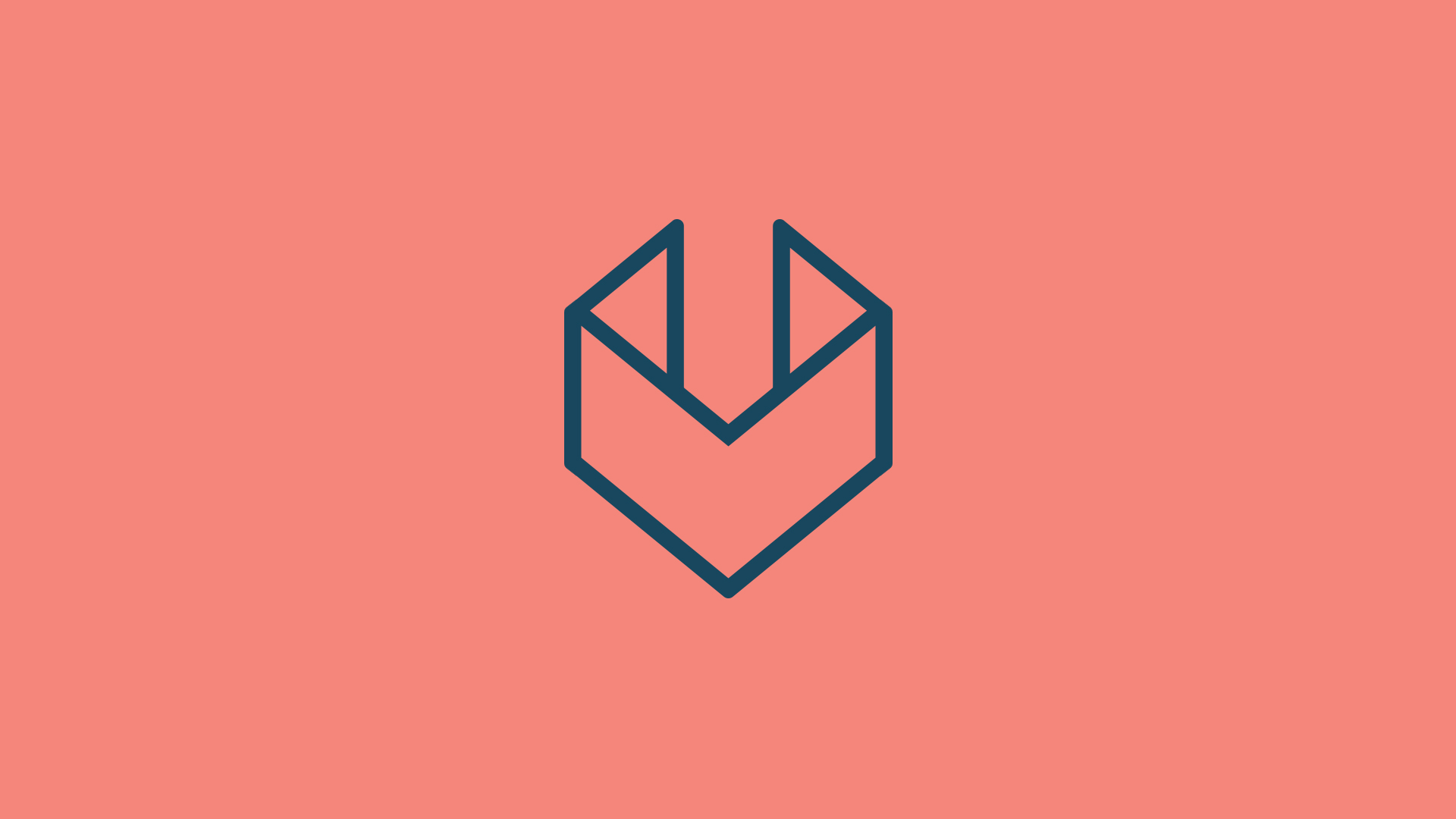
True Spa provides a guided experience of self discovery to help people connect to the best version of themselves. The logo uses a straight font as a foundational element. The mark references oragami and the unfolding of your mind as you find the true you. The mark also forms the shape of a "U" to emphasize the idea that True can help you find the true you. The brand colors balances vibrancy and subtlety. It also includes a dark and a light complementary color to expand usability and create a versatile look.
The mark references oragami and the unfolding of your mind as you find the true you. The mark also forms the shape of a "U" to emphasize the idea that True can help you find the true you.
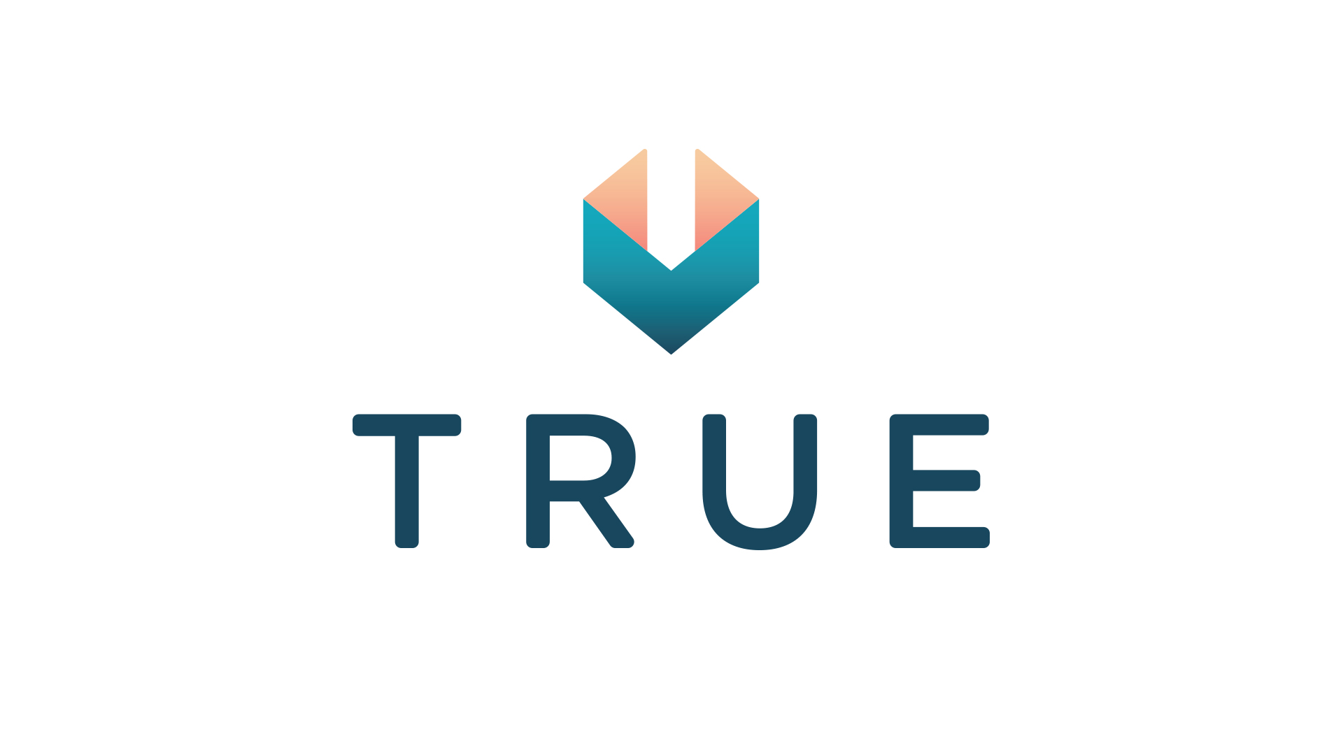
An alternate logo was designed for use in projects where depth is a key factor. This version show light on the inside, representing the light that is waiting to be released through the guided process at True Spa.